Five tasks. Five days each. A five-person team, one task per person.
On paper, the project takes five days. In practice, it lands on day twelve, and nobody working on it did anything wrong.
Those seven extra days didn’t come from a blown estimate or a slow team member. They were built into the schedule from the start, sitting inside two things most project plans never name properly: lead time and lag time. Get them confused, and a schedule that looks perfectly logical on a Gantt chart quietly drifts weeks past where it should have landed.
Two Delays Wearing the Same Name
Here’s where most explanations of this topic go wrong: they define lead time as “how long a task takes.” That’s not lead time in a schedule. That’s just task duration.
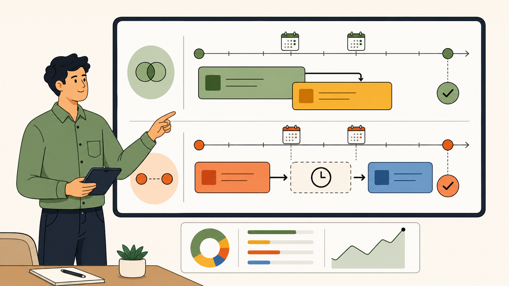
In project scheduling, lead time is the overlap you deliberately build in so a successor task can start before its predecessor finishes. If design review usually needs the full brief signed off, but you let the developer start environment setup two days early because that part doesn’t depend on the brief, you’ve given that task two days of lead. Most scheduling tools enter this as a negative value against the dependency, because it’s compressing the timeline, not extending it.
Lag time runs the other way. It’s the enforced wait between a predecessor finishing and a successor starting. Concrete has to cure before you build on it. A client has to sign off before development starts.
That wait is lag, and it’s not a flaw in the plan. A schedule with zero lag anywhere is usually a schedule that hasn’t accounted for real dependencies at all.
There’s a third term worth separating out here, because it gets tangled into the same conversation constantly: leading and lagging indicators. Those come from KPI and OKR frameworks, not scheduling. A leading indicator predicts an outcome before it happens (proposals sent this week); a lagging indicator confirms it after the fact (revenue closed last quarter).
It has nothing to do with task overlap or delay, but the shared vocabulary means teams routinely talk past each other in the same planning meeting. And if you’re mapping workflow timing more broadly, cycle time and flow efficiency measure something different again: how long a task actually sits in progress once work begins, not the overlap or wait built around it.
Term
What it actually measures
Where you’ll see it
Lead time (scheduling)
Overlap allowed between a predecessor and successor task
Enforced wait between a predecessor finishing and a successor starting
Gantt charts, dependency fields, buffer planning
Lead time (supply chain)
Total duration of a task or order from start to finish
Manufacturing, procurement, fulfilment reporting
Leading / lagging indicators
Predictive vs. confirmed business metrics
KPI dashboards, OKR reviews, sales and revenue reporting
Four terms, three completely different jobs, one shared vocabulary. Sort that out first, and the rest of this gets a lot easier to act on.
What Lag Time Actually Costs You
Say your delivery process runs design, then client sign-off, then development. The sign-off step regularly takes three or four days across a handful of concurrent client engagements. That’s not one delay. It’s lag, and it’s completely normal to plan for it.
What’s not normal is what happens to the designer during those three or four days. If nothing else is scheduled against them, that’s not a pause, it’s bench time: hours that show up on a timesheet as logged but not billable, or worse, not logged at all because there’s nothing obvious to attach them to. Multiply that across five or six client projects running the same lag pattern every month, and you’re not looking at a handful of quiet afternoons. You’re looking at fifteen to twenty days of unplanned capacity a month, sitting invisible until someone finally asks why utilisation dropped.
💡 Pro Tip: Treat known lag windows as schedulable capacity, not dead time. If sign-off reliably takes three days, that’s three days to deliberately assign a different billable task to the same person, not three days to hope nothing goes wrong.
The fix isn’t eliminating lag. Some of it is unavoidable and some of it is genuinely protective, giving a team room to breathe between handoffs instead of running everything back to back. The fix is knowing which lag windows repeat, and planning something billable into them instead of letting them sit empty. That’s the utilisation patterns worth watching, and it’s exactly the kind of signal that gets lost when resourcing decisions are made project by project instead of across the whole team’s capacity.
What Compressing Lead Time Actually Costs You
Lead time has the opposite problem. It looks like a win right up until it isn’t one.
Picture a developer starting build work two days before the brief is formally signed off, because the client relationship is solid and everyone’s confident nothing major will change. Most of the time, that confidence is earned and the two days genuinely save the project time. Occasionally, the client comes back with a change that touches exactly the part already built.
Now there’s rework, and rework rarely shows up as a clean line item. It shows up as actual effort quietly overtaking allocated effort on that task, and as hours that don’t map cleanly to anything billable, because reworking something already built isn’t the same conversation as building it the first time.
💡 Pro Tip: Only compress lead time on tasks where the upstream deliverable is genuinely stable, not just probably fine. If a brief has changed twice already, that’s not a candidate for early starts.
This is the same non-billable creep that shows up in scope drift, just triggered from the opposite direction. Scope drift usually gets framed as the client asking for more. Lead time compression is the team giving more before it’s confirmed to be needed, and the financial signature on the timesheet looks almost identical either way: hours that don’t reconcile against what was actually signed off.
Building Both Into the Schedule Before They Cost You
Most of this is manageable the moment lead and lag stop living in someone’s head and start living in the schedule itself.
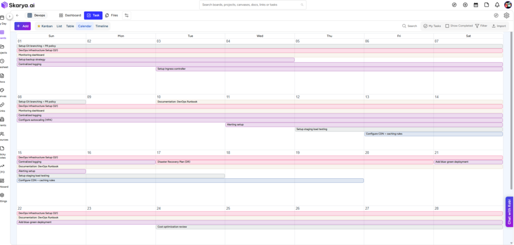
In Skarya, this is what the Dependencies tab on a task is built for: it shows the full relationship between a task and what it’s waiting on or overlapping with, alongside status, priority, assignee, and dates, all in one table instead of scattered across separate conversations. The Timeline view then lets you see those overlaps and gaps visually across a whole board, which is a far faster way to spot an unplanned three-day gap than reading it off a list. Pair that with Allocated Effort set at the task level, and you’ve got a plan that accounts for lead and lag on purpose, rather than discovering both after the fact.
💡 Pro Tip: When you set up a new dependency, ask which direction it should move before you touch the number. Overlap (lead) speeds things up but adds risk. Delay (lag) protects quality but costs capacity. Neither is automatically the right call, but guessing is always the wrong one.
None of this replaces the eight-step build we walk through separately for putting a full schedule together. It’s the layer that sits underneath it, the part that decides whether the schedule you build actually survives contact with real dependencies.
Catching Drift Before the Invoice Does
The earliest warning sign that lead or lag has gone wrong isn’t a client complaint. It’s the gap between Allocated Effort and Actual Effort on a task, and it shows up long before anyone notices the project’s running late.
If a task’s actual hours are consistently running ahead of what was allocated, and the pattern clusters around tasks that started early or followed a compressed dependency, that’s lead time compression turning into rework, caught while it’s still one task instead of a project-wide blowout. If bench time keeps appearing on the same handful of engagements during the same handoff points, that’s lag time that was never planned for, sitting there every single cycle.
💡 Pro Tip: Review Allocated vs. Actual Effort weekly, not monthly. By the time a monthly report flags it, the pattern’s already repeated three or four times across active projects.
Neither of these needs a new report to catch. They need someone actually looking at the fields that already exist, at a cadence tight enough to matter.
The Real Takeaway
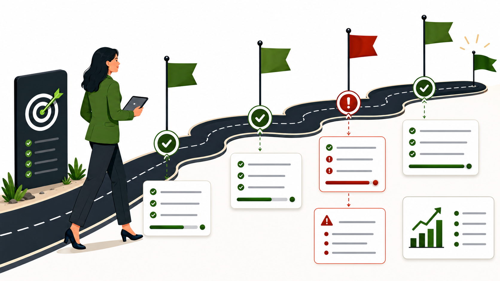
A schedule isn’t just a list of dates. It’s a set of decisions about where you’ve deliberately built in overlap, where you’ve deliberately built in wait, and where you’ve done neither and are simply hoping it works out. Once you start reading a Gantt chart that way, a “five-day” project landing on day twelve stops being a mystery. It’s just lead and lag, doing exactly what they were always going to do, whether anyone planned for them or not.
Two people pull up the same client’s margin number in the same meeting and get two different answers. Neither one is lying. Neither spreadsheet is broken, not technically. They just built their version three days apart, and nobody noticed until someone asked the wrong question out loud.
That moment tells you something a broken formula never could. Your firm hasn’t got a spreadsheet problem. It’s got a visibility problem, and the spreadsheet is just where it shows up first. Here are the five signs that tell you which stage you’re actually at.
1. You Only Find Out a Project Lost Money After It’s Already Over
Allocated hours live in one tab. Actual hours land in another, usually a week or two behind, entered by whoever remembered to update it before the Friday deadline. Nobody’s comparing the two in real time, because comparing them properly means sitting down and doing it by hand, and there’s always something more urgent that week.
So the gap between what a project was supposed to cost and what it actually cost only becomes visible at the wrap-up meeting, or worse, on the final invoice. By then, the decision that would have fixed it, pulling a junior off the account, renegotiating scope, flagging the client early, is three weeks too late to matter.
Pro Tip: If allocated versus actual effort is something you check at project close rather than in week two, you’re not managing margin. You’re documenting it after the fact.
You might already log actual hours every week, which is a fair objection. But logging isn’t the same as comparing. The question that actually protects margin isn’t whether the hours got entered, it’s whether anyone put the allocated figure next to the actual figure while the project was still live enough to change course. Most firms can answer yes to the first and no to the second, and that gap is where the loss quietly builds.
2. Your Margin Number Depends on Who Built the Pivot Table That Week
Ask two people in the same firm what a client’s current margin is, and you’ll often get two different numbers, both technically correct, built from slightly different snapshots of the same messy source data. One tracker rounds differently. Another hasn’t been updated since the last invoice went out. A third had last month’s formulas copied into this month’s tab, and nobody checked whether the cell references still pointed where they should.
None of this is anyone being careless. It’s what happens when the source of truth is a file, not a system.
The real cost isn’t the confusion in the meeting. It’s the decision that gets made, or doesn’t, because nobody trusts the number enough to act on it. You can’t reprice a retainer, pull resources off a losing account, or have an honest conversation with a client about scope creep based on a figure three people would each calculate differently.
In practice, what we’ve consistently seen is that firms don’t fix this by asking people to be more careful with their spreadsheets. Carefulness isn’t the constraint. The constraint is that a spreadsheet has no memory of which version is correct, no audit trail of who changed what, and no way to stop someone from overwriting a formula by accident. A system that calculates margin from the same underlying task and timesheet data every time doesn’t need anyone to be careful, because there’s only one number to look at in the first place.
3. Utilisation Is a Guess, Not a Calculation
Utilisation should be simple: billable hours divided by available capacity. In practice, billable hours live in the timesheet file, available capacity lives in someone’s head or an HR spreadsheet, and the two rarely get reconciled on the same day, let alone the same hour.
So when someone in a Monday meeting says the team’s running at 78% utilisation, what they usually mean is that it felt about right last time they checked. Nobody’s being dishonest. There’s just no single, current source connecting hours logged to hours available.
Pro Tip: If your utilisation figure changes depending on who you ask, it’s not a metric yet. It’s an opinion with a percentage sign on it.
This matters more than it sounds like it should, because utilisation is a staffing signal, not just a reporting one. Consider a firm whose billable utilisation sits stubbornly around 60% for two consecutive quarters. That pattern usually points to one of two things: either the pipeline isn’t generating enough billable work for the team it has, or the team has grown ahead of the work in front of it. Those are two different problems with two very different fixes, and you can only tell them apart if the number in front of you is accurate on the day you’re looking at it, not an average someone eyeballed from last month.
We’ve written more on why this actually matters for a growing firm, not just as a reporting exercise but as a resourcing one, in why managing resources properly changes outcomes.
4. One Person Is the Only One Who Can Tell You What’s Actually Going On
Every firm running on spreadsheets eventually has one person who understands how the whole system fits together. They built the master tracker. They know which tab feeds which formula, which client’s numbers need a manual adjustment because of a billing quirk from eighteen months ago, and which cells you’re not allowed to touch.
That’s not really a personnel risk. It’s a visibility risk. When that person is on leave, in back-to-back client meetings, or simply hasn’t had time to update the tracker this week, nobody else can say with any confidence which clients are trending toward a loss right now. The business isn’t blind because people aren’t paying attention. It’s blind because the only person who can see is currently unavailable.
Pro Tip: A good test: pick any client today and ask someone other than your spreadsheet owner what that account’s margin looks like this month. If they can’t answer within a minute, the business is running on one person’s memory, not a system.
This isn’t a criticism of that person, and it isn’t fixed by hiring a backup or writing better documentation, although both help. It’s fixed by moving the knowledge out of a person’s head and into a system where the answer is the same regardless of who’s asking or who’s away. The firms that handle this well haven’t found a more disciplined spreadsheet owner. They’ve built a setup where the numbers don’t depend on any one person remembering anything.
5. Revenue Is Up, But You Can’t Say Which Clients Are Actually Paying For It
This is the sign that gets missed the longest, because it hides behind good news. Top-line revenue climbs. New logos come in. Everyone feels like the firm is growing. But growth in aggregate revenue says nothing about which specific clients are actually profitable and which ones are quietly eating the margin the profitable ones generate.
A growing firm can still be losing money on a meaningful slice of its client base at the same time, and a spreadsheet built around total revenue will never surface that. What it takes is a per-client breakdown: signed value against earned revenue, cost against margin, one row per relationship, not one column for the whole business.
There’s a related number worth naming here: backlog, the gap between what a client has signed and what’s actually been earned so far. A healthy backlog means there’s work still to deliver and bill. A backlog that keeps growing while margin on that same client keeps shrinking is an early warning that the relationship is heading toward trouble well before the invoice ever reflects it. Most spreadsheets don’t track backlog at all, because it requires connecting a contract value to ongoing delivery in a way a single tab was never built to do.
This is the pattern we built Skarya’s CFO Dashboard around: not a bigger spreadsheet, but a live per-client view that updates from the work itself, so margin erosion on one account shows up long before it drags down the average.
It’s the same underlying risk we cover more broadly in what actually threatens a growing service business, because a client quietly bleeding margin is a risk long before it’s a crisis.
What to Look For Before You Move Off the Spreadsheet
Recognising the signs is one thing. Knowing what actually needs to be true on the other side of the change is another. Whatever you move to next, four things need to hold, or you’ve just built a more expensive spreadsheet:
One current source for planned and actual hours, not two files reconciled after the fact
Margin calculated per client while the work is still live, not assembled at month-end
Utilisation connected to real capacity and real logged hours, not estimated out loud in a meeting
Visibility that doesn’t depend on one person, so the answer is the same regardless of who’s asking
A simple way to see the shift is side by side:
Spreadsheet-led operation
Connected system
Margin checked at project close
Margin visible while work is delivered
Multiple personal versions of the truth
One current record everyone reads from
Utilisation estimated in conversation
Utilisation calculated from logged hours
Knowledge held by one spreadsheet owner
Visibility shared by role, not by memory
Revenue viewed in aggregate
Profitability viewed per client
Where This Actually Leaves You
None of these five signs show up because a firm did anything wrong. Spreadsheets are the right tool for five people and one client each. They stop being the right tool somewhere around the point where checking the numbers takes longer than doing the work the numbers are supposed to describe.
The firms that catch this early aren’t the ones with better spreadsheets. They’re the ones who stop asking who has the latest version and start asking what a client’s margin looks like right now, and whether everyone who needs to know can actually see it. That’s a different question, and it needs a different kind of answer than another tab.
Two developers look at the same ticket. One says three points. The other says eight. Neither of them is wrong yet, they just haven’t talked about it. That five-point gap is the actual reason story points exist, and it’s the part most explanations skip straight past on their way to the Fibonacci sequence.
If you’ve sat through a planning poker session where the numbers landed nowhere near each other, you already know the real value isn’t the number the team lands on. It’s the few minutes of conversation between the first guess and the final one, where somebody finally says, “wait, why do you think this is that much bigger?”
Put simply, story points in Agile are a relative estimation method used to understand effort, complexity, and uncertainty before a team commits to work. They are common in Scrum story point estimation, but they are not a Scrum rule, a time unit, or a replacement for real discussion.
What Story Points Actually Measure
A story point is a number a team assigns to a task, a bug, or a user story, meant to capture three things at once: how much work is involved, how complicated that work is, and how much of it is still unknown. Those three don’t line up neatly, which is exactly why teams stopped guessing in hours and started guessing in points instead.
A task can be short and still carry real risk, like touching a payment flow nobody on the team has changed in two years. Another task can be long and completely predictable, like duplicating twelve near-identical landing pages from an existing template. Hours would treat these as similar. Points, done properly, wouldn’t.
The number itself isn’t a disguised unit of time. It’s closer to a shorthand for how nervous the team should be about a piece of work, filtered through effort and complexity together. A 2 usually means someone in the room has done almost exactly this before. An 8 usually means someone is quietly worried about what they don’t know yet, even if they can’t name it precisely.
Why Story Points Are Not Hours
This is where most estimation systems quietly fall apart. Somewhere in a team’s history, someone decides one point equals two hours, and from that point forward, the estimate stops being an estimate. It becomes a disguised deadline, and people start treating it exactly like any other hard commitment: padding numbers on unfamiliar work, avoiding anything with an unclear spec, or inflating points on anything involving a client who tends to change their mind mid-project.
Once points map cleanly to hours, the useful part of estimation disappears. Nobody needs to ask why one task feels bigger than another when the answer is just multiplication. And because two people can genuinely take different amounts of time on identical work (a senior developer who’s touched this exact integration a dozen times, a junior one seeing it for the first time), tying points to hours quietly turns an estimate of the work into a judgment of the person doing it.
It’s worth saying plainly: this isn’t a hypothetical failure mode. It’s the single most common way story points stop working, and it usually happens gradually enough that nobody notices until estimates start feeling like promises again.
Pro Tip: If someone asks “so how many hours is a point, roughly,” treat that as the moment to revisit the points-versus-hours conversation with the whole team, not as a question that deserves a clean answer.
Why Fibonacci Story Points Use 1, 2, 3, 5, 8, 13, 21
Ask a room to choose between 6 and 7 points and you’ll get a ten-minute argument that changes nothing about how the sprint plays out. Ask the same room to choose between 8 and 13, and the gap actually means something: someone is seeing hidden complexity the other person hasn’t spotted.
That’s the whole logic behind the Fibonacci-style scale. Small numbers sit close together because small tasks really can be sized accurately; the difference between a 1 and a 2 is usually obvious to everyone in the room. Past 8, the gaps widen on purpose, because nobody can honestly tell you whether a big, murky task is a 19 or a 22, and pretending otherwise just burns a meeting arguing over false precision.
A 13 or a 21 sitting in a backlog isn’t really a measurement. It’s a flag. It says this is too large and too uncertain to size honestly in its current form, so the conversation should be about splitting it, not about which number best captures it.
What each story point usually means
The exact meaning depends on each team’s own history, but a healthy Fibonacci story points scale usually has a clear pattern. A 1 is small and obvious. A 2 is still simple but needs a little more effort. A 3 is moderate and fairly understood. A 5 has more steps, more coordination, or more review involved. An 8 carries real complexity or uncertainty. A 13 is a sign the story may need to be split. A 21 usually means the work is too large or too unclear to commit to in its current form.
How Planning Poker Works in Story Point Estimation
Planning poker works because it hides everyone’s number until the whole room reveals together. Someone reads the ticket out loud, the team asks a handful of sharp questions about scope and edge cases, and then everyone silently picks a card.
The interesting moment isn’t when the numbers match. It’s when a 3 lands next to an 8. That gap usually means one person knows about a dependency, an approval step, or a messy edge case the other person hasn’t considered yet. The five seconds where three fingers go up next to eight fingers does more to surface hidden risk than an hour of status updates ever could.
Skip that reveal and estimate silently in a spreadsheet instead, and the exercise still produces numbers, just not the useful kind. The numbers come out fine. The conversation that was actually worth having never happens.
How Story Points Support Sprint Planning and Velocity
Velocity is simply the average number of points a team finishes per sprint, tracked over three or four cycles. If a team lands around 24 points a sprint on average, that number becomes a planning ceiling for the next sprint, not a target to beat.
Where this goes wrong is predictable. A manager starts treating velocity like a scoreboard, pushes the team to hit 30 points every sprint, and watches two things happen at once: estimates creep upward on work that hasn’t actually changed, and “done” starts meaning something looser than it used to. Neither of those is an improvement, even though the number on the chart looks better.
A dip in velocity isn’t automatically bad news either. Someone was out for half the sprint, a dependency landed three days late, or the work turned out to carry more edge cases than anyone flagged during refinement. Velocity is a planning input a team uses to size its own next sprint. It was never built to be a performance review, and teams that use it as one usually end up with worse data, not better output.
Pro Tip: Track velocity as a rolling four-sprint average rather than sprint by sprint. One bad sprint tells you almost nothing on its own. Four sprints in a row start to tell you something real about actual capacity.
Backlog Refinement: How Fuzzy Tasks Become Estimable
Nobody can put an honest number on “improve the dashboard.” Refinement is the session where that vague line turns into something a team can genuinely size: which chart, whose data, what approval step, what “improve” actually means to the person who wrote the ticket in the first place.
Skip refinement and the cost shows up immediately in planning. The room stalls on basic questions nobody thought to ask ahead of time. Estimates come back wildly inconsistent because half the team is picturing a different task to the other half. The sprint starts carrying more uncertainty than it needed to, and that uncertainty doesn’t disappear, it just gets discovered later, mid-sprint, at a worse time.
Refinement also catches work that shouldn’t be estimated yet at all. Some tickets need a stakeholder decision before anyone can size them honestly, and forcing a number onto that kind of task just produces a confident-looking guess built on a question nobody’s actually answered.
Fifteen minutes of refinement the week before a planning session routinely saves an hour of confused back-and-forth in the meeting itself. That trade is almost never a bad one.
When a User Story Should Be Split
A 13 or a 21 sitting in a sprint is rarely one task. It’s usually three or four smaller ones wearing a trench coat. “Build the reporting dashboard” quietly contains wireframes, a chart component, a data connection, filter logic, and a stakeholder review, each one genuinely estimable on its own once it’s pulled apart.
Splitting isn’t just tidier bookkeeping, either. It changes what the team can actually show partway through a sprint. A single 13-point task is either done or not done by demo day, with nothing useful to show in between. Five smaller pieces let the team demonstrate progress as it happens, and let a stakeholder catch a wrong assumption on day three instead of finding out on day twelve that the whole thing was built on a misunderstanding.
What a Healthy Sprint Point Spread Looks Like
Most sprints hold up better with a mix, not a pile of similar-sized tickets. A sprint made entirely of 8s and 13s usually means the backlog wasn’t refined properly before planning, and the team is about to discover a lot of hidden complexity mid-sprint. A sprint made entirely of 1s and 2s can look productive on a burndown chart, but it’s often busywork dressed up as delivery, with the genuinely hard problem quietly pushed to next sprint again.
A sprint that mixes a couple of small, low-risk tasks with two or three medium ones, and maybe one larger, well-understood piece, tends to hold up better under pressure. If something runs long or a dependency falls through, there’s still enough smaller work to finish and demo, rather than the whole sprint riding on one large ticket landing perfectly.
Story points beyond software
Story points started in software teams, but the same logic holds anywhere work gets planned in short cycles. A one-line copy fix on a website is a 1. A blog outline with a clear brief is a 3. A full SEO article with research, drafting, and editing sits closer to 5 or 8, depending on how much of the research still needs doing. A campaign landing page with strategy, design, build, tracking, and sign-off easily runs 8 to 13, not because the words take longer to type, but because that many people and approvals genuinely have to line up before it ships.
The size differences matter for the same reason they matter in software: a 1 and an 8 shouldn’t be scheduled the same way inside a week. A content team that treats every blog post as roughly equal effort ends up either overcommitting a sprint or leaving capacity sitting idle, the same mistake a dev team makes when it quietly assumes every ticket takes about a day.
One practical way to apply this is to keep story points visible beside real delivery signals after a sprint closes. In Skarya, for example, teams can plan with Sprint and Story Points fields in the Agile Development Board, then compare Allocated Effort with Actual Effort across Phase and Iteration. The point is not to convert story points into hours. It is to notice where estimates held up, where they did not, and what the team should learn before the next planning session.
Who Should Estimate Story Points?
The people doing the work should be the ones sizing it. A manager assigning points from outside the work is really just assigning a deadline with extra steps. A product owner estimating alone misses whatever the developer, designer, or tester in the room would have flagged in the first thirty seconds of looking at the ticket.
Cross-functional work needs cross-functional estimation. A designer spots the two rounds of stakeholder feedback that always show up on this kind of request. A developer spots the API that’s changed twice already this year. A tester spots the edge case nobody bothered to mention in the ticket description. Leave any of those voices out of the room, and the number that comes out the other end is a guess wearing an estimate’s clothing.
Common Story Point Estimation Mistakes
The most common failure isn’t a bad number, it’s a good number used badly. Points get compared across two different teams as though a 5 means the same thing to both of them, when every team’s scale is really calibrated to its own history and its own skill mix. Points get used to rank individual output, turning a planning tool into a performance metric it was never designed to be. Points get quietly inflated on anything involving a difficult client or an unclear spec, until nearly everything lands on 8 regardless of what it actually involves.
None of this means story points are the problem. It means the discipline around them slipped, usually without anyone deciding it should.
Pro Tip: If nearly every ticket in a sprint lands on the same one or two numbers, that’s not consistency. It’s a sign the scale has stopped meaning anything, and it’s worth resetting against three or four shared reference tasks the whole team agrees on.
Are Story Points Just Guessing With Extra Steps?
Fair question, and one worth answering honestly rather than waving away. Yes, a story point is still a guess. Nobody serious claims otherwise. What changes is who’s doing the guessing and how visible the disagreement becomes. One person guessing alone in a spreadsheet produces a single set of blind spots, multiplied quietly across the whole backlog. A room of five people guessing out loud, comparing numbers, and arguing over the gaps produces something closer to a shared, tested guess, one that’s already survived a round of scrutiny before the sprint even starts.
That doesn’t make the estimate accurate in any absolute sense. It makes it calibrated, which is a different and more useful thing. An estimate a team has argued about is worth more than a precise-looking number nobody has questioned.
Do All Agile Teams Need Story Points?
Story points aren’t mandatory, and plenty of well-run teams operate without them. Some size work in t-shirt sizes, small, medium, large, when a rougher signal is genuinely enough. Some track cycle time and throughput instead, particularly teams running continuous flow rather than fixed sprints. Some just estimate in hours honestly, without pretending the number is more precise than a guess with digits attached.
The right call depends on what the team is actually trying to learn. If the goal is understanding relative effort and planning sprint capacity with some rigour, points earn their keep. If the team just needs a rough read on size without the planning-poker overhead, t-shirt sizes get there faster and with less process. There’s no prize for running the more complicated method if the simpler one already tells the team what it needs to know.
Final Thoughts
A story point stays useful for exactly as long as it stays a conversation starter instead of a scoreboard. The moment it turns into a hidden deadline, or a way to quietly compare people against each other, it’s already stopped doing its job. It’s worth pulling the team back, every so often, to what the number was actually meant to protect in the first place: an honest, shared read on how big something really is before anyone commits to delivering it.
Frequently Asked Questions
What are story points in Agile?
Story points are numbers a team assigns to a task, bug, or user story to capture its effort, complexity, and uncertainty relative to other work. They help the team compare work size before the sprint starts, instead of pretending every task can be predicted in exact hours.
What is story point estimation?
Story point estimation is the team process of discussing a task and agreeing on its relative size. The estimate is useful only when it comes from shared context, not from one person assigning a number in isolation.
Are story points part of Scrum?
Story points are commonly used by Scrum teams, but they are not mandatory in Scrum. They are an Agile estimation technique many Scrum teams choose because they make sprint planning and backlog refinement easier to discuss.
Are story points the same as hours?
No. Story points measure relative size and risk, not duration. Converting them into hours turns the estimate into a hidden deadline, and it removes the reason teams use points in the first place: to discuss effort, complexity, and uncertainty honestly.
Why do teams use the Fibonacci scale for story points?
The widening gaps between 1, 2, 3, 5, 8, 13, and 21 stop teams arguing over false precision on large, uncertain work. The scale keeps small tasks easy to size, while making it obvious when bigger work carries more risk and should possibly be split.
What is planning poker?
Planning poker is an estimation method where each team member privately picks a story point value, then everyone reveals at once. Big gaps between individual estimates usually point to hidden risk, missing context, unclear scope, or assumptions the team needs to discuss before committing.
What is velocity in Agile?
Velocity is the average number of story points a team completes per sprint, typically tracked over three or four sprints. It helps with sprint capacity planning, but it should be treated as a planning signal, not a target to push higher every single cycle.
When should a story be split instead of estimated?
When a task lands around 13 or 21 points, it is usually several smaller, genuinely estimable pieces bundled together. Splitting it improves estimate accuracy, reduces sprint risk, and gives the team better visibility into progress partway through the sprint.
Can non-software teams use story points?
Yes. Content, marketing, design, and service delivery teams can use story points the same way. A quick copy edit might be a 1, while a full campaign landing page with strategy, design, build, tracking, and sign-off can run 8 to 13.
Do all Agile teams need to use story points?
No. Some teams use t-shirt sizes, hours, or flow metrics like cycle time instead. Story points help most when a team wants to plan sprint capacity around relative effort, compare work across a backlog, and make estimation conversations more visible.
An effective employee onboarding checklist for agencies covers three layers: system access, work context, and financial setup. Getting a new hire’s hourly rate, resource allocation, and timesheet workflow configured correctly from the start determines whether their first month of work shows up accurately in project profitability reporting.
What Makes Agency Onboarding Different
At a product company, a new hire’s first two weeks are largely internal. At an agency, client deliverables are already in motion the day they walk in. That single fact changes the shape of onboarding considerably.
Standard employee onboarding covers account setup, tool access, and policy documentation. Agency onboarding needs two more layers: work context (which clients, which projects, what stage of delivery each engagement is at) and financial setup (how their time will be tracked, what counts as billable, how their hours connect to project margins).
Skip work context and the new hire spends the first week interrupting colleagues with questions a board walkthrough would have answered in ten minutes. Skip financial setup and their first month of timesheets logs without a cost rate attached, producing margin data that requires manual correction before it reflects anything real.
What does an employee onboarding checklist for agencies include?
A complete agency employee onboarding checklist includes: system and application access, workspace setup (boards, projects, client allocation, task context), financial configuration (hourly rate, resource record, timesheet approver), billable and non-billable orientation, and a 30-day operational check-in to verify billing accuracy and confirm the new hire is correctly embedded in delivery workflows.
Before Day One: The Pre-Boarding Setup Checklist
The week before a new hire starts is when the setup work happens. Done well, day one is orientation. Done poorly, it is troubleshooting.
Area
Pre-boarding task
IT and access
Work email provisioned, communication tools and core platform access granted
Workspace setup
Added to relevant boards and projects with the correct role (Agent or Manager); client records visible
Resource record
Profile created: role, skills, hourly rate, allocation type (monthly or weekly), allocation period, and start date configured
Timesheet approver
Approving manager assigned and approval cadence agreed (example: submit by Friday, approved by Monday morning)
Work context prep
Active boards reviewed so a walkthrough is ready for day one: current task status, upcoming deadlines, and delivery context visible
Tip: Configure the hourly rate in the Resources module before week one timesheets begin. Once hours log without a rate attached, cost figures in financial reporting are blank until a manual backfill is run.
Day One: Operational Context, Not Just Account Access
Account setup takes an hour. The work context walkthrough deserves the same time.
Start with My Day: the daily planning view that pulls tasks from all boards and projects into a single screen. Walk the new hire through which boards they are allocated to and give a brief status summary for each active client: where the engagement sits in the delivery timeline, what is currently in progress, and what is due this week.
Introduce Kobi, the platform’s AI assistant, by running a board summary or project status report together. It shows in thirty seconds how work information is organised across the workspace, and gives the new hire a functional orientation rather than a blank screen.
Before the day ends, log a partial timesheet entry: even two hours of onboarding time marked non-billable establishes the habit. Daily time logging starts on day one or it has to be rebuilt later.
How quickly should a new agency hire start logging billable time?
Billable time logging typically starts by end of day one or early day two, once the new hire has been allocated to a client board and walked through the timesheet workflow. Non-billable time (onboarding, training, internal meetings) should also be logged from day one. Both types contribute to total utilisation tracking, so the daily logging habit applies from the start regardless of whether the work is billable.
First-Week Checklist: Building the Billing Rhythm
By end of week one, three things should be true: a complete timesheet covering all five working days has been submitted, the new hire understands the billable and non-billable distinction, and their manager has approved those hours.
The first-week checklist:
Full timesheet submitted, covering all five working days
Each entry correctly classified: billable (client-facing work) or non-billable (onboarding, internal meetings, training)
Hours logged against the correct boards and projects, not a generic placeholder
Manager reviews and approves the week one timesheet before the Monday cadence
One clarifying conversation about what qualifies as billable: five minutes of dialogue is more reliable than a policy document
The approval step carries more weight than it appears. Only approved hours count toward utilisation calculations and cost figures in financial reporting. A week one timesheet sitting in pending status is invisible to the system: not wrong, just absent from the numbers.
Tip: Run a five-minute debrief at end of week one. Ask the new hire what they logged, why, and whether anything felt ambiguous. Billable classification questions surfaced early do not compound into a month of incorrect entries.
The Financial Setup Layer
Every agency onboarding checklist covers system access. The configuration that connects a new hire to project profitability reporting is harder to find in writing.
Three inputs need to be in place before a new hire’s work generates accurate financial data.
Hourly rate in the resource record. This is the figure that converts approved timesheet hours into cost data. Without it, hours accumulate with no dollar value attached. The rate should reflect the team member’s fully loaded cost per billable hour, accounting for salary, benefits, and a share of business overhead.
Allocation period set. The Resources module needs a defined period to calculate utilisation: billable hours as a percentage of available hours. Set the allocation type (monthly or weekly), the allocation volume, and the start date. These three fields give the platform its denominator.
Timesheet approval workflow active. Only hours that pass through manager approval count toward financial calculations. Unsubmitted or pending timesheets are excluded from the system’s cost and margin figures. The approval gate is the financial integrity check, not a bureaucratic step.
When all three inputs are in place, every approved timesheet from the new hire feeds live cost data into board-level margin reporting from week one. For a broader look at why resource configuration matters across delivery, the guide on managing team resources effectively covers the operational case in full.
Why does onboarding setup affect project margin reporting?
Project margin is calculated from approved timesheet hours multiplied by resource hourly rates, subtracted from earned revenue. If the hourly rate is not configured at onboarding, the cost side of that calculation reads zero until the rate is added and hours are reprocessed. Margin figures appear artificially healthy until the correction is made, and the discrepancy is only visible when someone checks the underlying calculation directly.
The 30-Day Operational Check-In
Four weeks in, the onboarding checklist has usually been filed. The questions worth asking at the 30-day mark are operational, not cultural.
Four things to review:
Timesheet submission pattern. Are timesheets being submitted each week? A new hire who batches submissions at month-end introduces a reporting lag: the financial dashboard shows undercounted costs until the backfill is processed.
Billable hour allocation. Are hours logging against the correct client boards? A common first-month issue is time logged to a board rather than a specific task: the right client gets attributed, but task-level velocity data is inaccurate.
Utilisation figures. Does the Resources module show a utilisation rate that matches the new hire’s actual workload? A significant gap between reported and perceived utilisation usually points to one of three things: the allocation period was not configured, hours are being logged inconsistently, or non-billable time is being omitted.
Approval cadence. Are timesheets from weeks two and three approved? Pending timesheets from earlier in the month affect every margin figure those clients contribute to for that period.
The check-in takes fifteen minutes. It catches billing accuracy issues before they become a pattern that takes a quarter to correct.
Full Onboarding Checklist
A printable reference covering all four phases of agency employee onboarding.
Phase
Task
Owner
Pre-boarding
Work email and system access provisioned
IT / Admin
Pre-boarding
Added to boards and projects with correct role
Ops manager
Pre-boarding
Resource record created: hourly rate and allocation set
Ops manager
Pre-boarding
Timesheet approver assigned, cadence agreed
Manager
Pre-boarding
Board and client context prepared for day one walkthrough
Delivery lead
Day one
My Day and active board walkthrough completed
Manager
Day one
Kobi introduced: run a board summary together
New hire + manager
Day one
First timesheet entry logged (partial, non-billable)
New hire
Week one
Full five-day timesheet submitted
New hire
Week one
Billable vs non-billable classification discussed
Manager
Week one
Week one timesheets approved before Monday deadline
Manager
30 days
Timesheet submission pattern reviewed
Ops manager
30 days
Billable hours checked against correct client boards
Ops manager
30 days
Utilisation rate reviewed in Resources module
Ops manager
30 days
Approval cadence verified as consistent
Manager
Frequently Asked Questions
What is the typical onboarding timeline for a new hire at a digital agency?
Full operational integration at an agency typically takes two to four weeks. Week one covers system access, work context, and establishing the timesheet habit. Week two focuses on active client work and independent contribution to billable tasks. Weeks three and four confirm the new hire is fully embedded in delivery workflows. The 30-day check-in verifies that billing data from their work is accurate before patterns become difficult to correct.
How do you get a new team member up to speed on client accounts quickly?
Start with a board summary covering the client’s current task status: what is in progress, what is blocked, and what is due in the next two weeks. Follow with a fifteen-minute handover with the account lead. This is faster than a document-based brief and more accurate: it reflects the live state of delivery, not a kickoff summary written months earlier.
What onboarding steps most directly affect client billing accuracy?
Three setup steps drive billing accuracy: the resource record with a correctly configured hourly rate, the active timesheet approval workflow, and the new hire’s understanding of what counts as billable. If any of these three are missing at onboarding, cost data attributed to that team member’s work will be inaccurate until manually corrected.
Do contractors and part-time team members need a different onboarding checklist?
The structure is the same, but the financial configuration differs. Contractors typically have a different hourly rate and a project-based allocation model rather than a monthly one. Configure the resource record to reflect the actual engagement terms, and establish the billable scope clearly: contractors working across multiple clients may have different billing arrangements per engagement.
OKRs and KPIs are both performance frameworks, but they measure different things. KPIs track whether an important part of your business is operating as expected. OKRs define a specific improvement your team is working toward. Using one when you need the other is one of the quieter reasons team goals don’t stick.
Key Takeaways: OKRs (Objectives and Key Results) are goal-setting tools built for improvement. They define an ambitious target and the specific outcomes that prove progress. KPIs (Key Performance Indicators) are monitoring tools built for visibility. They track whether your operations are performing within a healthy range. KPIs show whether the business is running well. OKRs define what the team is actively trying to change. Both are valuable, and most high-performing teams use both simultaneously: KPIs to hold the baseline, OKRs to raise it.
Why Do Teams Confuse OKRs and KPIs?
It’s an easy mistake to make. Both use numbers. Both come up in planning meetings. Both get reviewed by managers and leadership. Both are tied, in some way, to performance.
But the similarity stops there.
A KPI is a performance signal, a number that tells you whether something important is operating as it should. An OKR is a goal-setting framework, a structure that helps a team define a meaningful improvement and track whether it actually happened.
The confusion starts when teams treat them as interchangeable. A KPI isn’t always a goal. An OKR isn’t just another metric. Mix the two without clarity and you end up with dashboards full of numbers nobody acts on, goals with no connection to daily work, and quarterly reviews that feel more like audits than decisions.
This guide explains the difference clearly, with practical examples for teams managing projects, clients, operations, delivery, or growth.
What Is a KPI?
A KPI (Key Performance Indicator) is a metric used to track the health of an important business activity. Not aspirational. Not directional. Just a clear, ongoing answer to one question: is this part of the business performing as it should?
Think of it like the dashboard of a car. The speedometer doesn’t tell you where to go. It tells you whether the engine is running at the right speed right now. That’s what a KPI does. It gives the team visibility into performance, so problems are easier to spot before they compound.
A project team tracking on-time delivery rate, for example, isn’t setting a goal. They’re watching a gauge. If the rate stays healthy, delivery is under control. If it starts dropping, the KPI becomes a signal to look deeper: planning, workload, approvals, client communication, or resource capacity.
That’s the job of a KPI. Not to define where the team is going, but to show whether the engine is running.
Pro Tip: A KPI without a threshold is just a number. Before finalising any KPI, define what “healthy” looks like, and what figure would prompt the team to act. If you can’t answer that clearly, you probably don’t need the KPI yet.
What Do KPIs Actually Look Like?
KPIs vary depending on the team and business function, but the pattern is consistent: they track what matters most to the health of that function.
A sales team may watch conversion rate, qualified pipeline volume, and monthly revenue. A marketing team might track demo requests, cost per lead, or campaign conversion. Customer support teams typically monitor first response time, resolution time, and client satisfaction. Project delivery teams often look at project margin, utilisation rate, overdue tasks, and scope change frequency. Finance teams track revenue, cost, margin, cash flow, and forecast accuracy.
The specific number matters less than the question it answers: does this help the team understand business health and make better decisions? A metric earns the title of KPI when it’s important enough to act on.
What’s the difference between a metric and a KPI?
Every KPI is a metric, but not every metric qualifies as a KPI. A metric is any quantifiable data point you track. A KPI is a metric that has been deliberately selected because it signals the health of something that genuinely matters to the business, and has a target or threshold attached to it. Page views are a metric. If page views are tied directly to your sales pipeline and you’ve set a monthly floor that triggers a content review when crossed, they’ve become a KPI.
What Is an OKR?
Where a KPI watches the current state, an OKR defines the future state a team is deliberately working toward.
OKR stands for Objectives and Key Results. The framework has two parts. The Objective describes what the team wants to achieve: qualitative, directional, and ambitious enough to require real change. The Key Results describe how the team will know it got there: specific, measurable outcomes that prove the Objective was actually reached, not just attempted.
An example makes this concrete:
Objective: Improve project delivery quality for key clients.
Key Results:
Increase client satisfaction score from 7.4 to 8.8
Reduce average project delay from 12 days to 4 days
Increase on-time milestone completion from 70% to 90%
Reduce rework hours by 25%
Notice what’s not in that list: tasks. “Hold weekly client meetings” is not a Key Result. It is an activity. It might support the Objective, but completing it doesn’t prove the Objective was achieved. A well-written Key Result describes the change the work was meant to produce, not the work itself. That distinction is where most OKR implementations fall apart.
What Is the Core Difference Between OKRs and KPIs?
The simplest way to put it: KPIs measure the present. OKRs describe the future you’re building.
KPIs track performance that needs to stay healthy. OKRs define improvement that needs focused effort. A KPI is usually ongoing. It stays in place because the business needs continuous visibility into that area. An OKR is time-bound, set for a quarter, half-year, or full year because the team has decided something specific needs to change.
Consider how the two sit alongside each other in practice:
A KPI may show that customer churn is currently 6%. An OKR may define the goal of reducing churn from 6% to 3% by end of quarter.
A KPI monitors average project margin monthly. An OKR targets improving that margin from 22% to 35% this cycle.
The KPI shows the condition. The OKR defines the change. Both are measuring performance, but they’re answering completely different questions.
Area
KPI
OKR
Purpose
Monitor business performance
Drive focused improvement
Main question
Are we performing well?
What do we need to change?
Timeframe
Ongoing
Time-bound
Format
Metric with a target or threshold
Objective with measurable Key Results
Best for
Stability, visibility, control
Direction, focus, progress
Example
Keep churn below 3%
Reduce churn from 6% to 3%
Review style
Regular performance check
Progress review against a goal
When Should You Use KPIs?
Use KPIs when you need to monitor an important part of the business on an ongoing basis, when the work is recurring and you already know what healthy performance looks like.
A service business tracking project margin every month isn’t working toward a specific improvement. They’re making sure profitability doesn’t quietly erode while the team is focused elsewhere. The same applies to utilisation, client retention, support response times, overdue work, or revenue. These aren’t temporary goals. They’re operating signals that need to stay visible indefinitely.
What makes a KPI actually useful is a clear target or healthy range attached to it. “Track utilisation” is too vague to act on. “Keep billable utilisation between 70% and 80%” gives the team something to respond to: below 70%, profitability is at risk; above 80%, the team may be heading toward burnout.
Every KPI should also have a named owner, someone responsible for reviewing it and raising questions when it shifts. A KPI without ownership tends to become a number people look at in meetings but never manage between them.
Pro Tip: At the start of each quarter, audit your KPI list. If a number has been sitting on your dashboard for six months without ever triggering a decision, it’s not a KPI. It’s noise. Cut it or sharpen it.
When Should You Use OKRs?
Use OKRs when the team needs to create a specific improvement, when maintaining the current level isn’t enough.
This is where KPIs and OKRs work together most naturally. A KPI might show that customer satisfaction is low. The OKR gives the team a focused plan to fix it. The KPI identifies the gap. The OKR closes it.
OKRs suit goals like improving onboarding, reducing delivery delays, increasing product adoption, strengthening the sales pipeline, or improving operational efficiency: anything where the team needs to actively move a number rather than just watch it.
Two things to get right when writing an OKR: the Objective should be clear enough that anyone on the team understands what winning looks like, and the Key Results should be specific enough to review honestly. If the Objective is too vague, the team won’t know how to act on it. If the Key Results are just tasks, the team can complete all of them and still fail to improve performance.
Do OKRs replace KPIs?
No, and treating them as substitutes is one of the more common missteps. OKRs are time-bound and goal-specific; they cycle out when the quarter ends. KPIs are ongoing and persistent. A team might run an OKR to improve on-time delivery, then retain on-time delivery rate as a permanent KPI once the new standard is set, making sure the improvement doesn’t quietly fade once the focused push is over.
A Practical Way to Choose Between the Two
When you’re not sure which to use, one question usually resolves it:
Are we trying to maintain performance, or improve something?
If the answer is maintain, use a KPI. If the answer is improve, use an OKR.
If a team wants to keep project margin above 30%, that’s a KPI. If they want to get it from 20% to 30%, that’s an OKR. If a team wants support response time to stay under four hours, that’s a KPI. If they need to bring it down from twelve hours to four, that’s an OKR.
This distinction also prevents two failure modes that show up constantly: turning every number into a goal (OKR bloat), and mistaking healthy operations for strategic progress (KPI complacency). The question of maintain vs. improve is the cleanest dividing line between them.
Can OKRs and KPIs Be Used Together?
Not only can they, most teams should use both simultaneously. The frameworks aren’t competing. They’re designed for different jobs, and they reinforce each other when both are in place.
The pattern that works well in practice: KPIs hold the floor while OKRs raise the ceiling. The KPI tracks a performance area on an ongoing basis. If it starts declining, the team uses that signal to write an OKR focused on fixing it. Once the OKR cycle ends and the improvement is embedded, that metric stays as a KPI, watched now to make sure the new standard holds.
Here’s what that looks like end-to-end:
A project delivery team’s KPI shows that only 65% of projects are being delivered on time. They write an OKR:
Objective: Improve delivery predictability for client projects.
Key Results:
Increase on-time delivery from 65% to 90%
Reduce average project delay from 10 days to 3 days
Reduce last-minute scope changes by 30%
Improve client satisfaction score from 7.2 to 8.5
The KPI identified the problem. The OKR structured the response. After the OKR cycle, on-time delivery continues to be monitored as a KPI, because the team now has a standard worth protecting.
This is how the two frameworks support each other: KPIs keep the team aware; OKRs move the team forward.
The Most Common Mistakes Teams Make
Tracking too many KPIs. Dashboards tend to grow over time. Every team adds their own metrics, nobody removes any, and six months later there are 40 numbers that nobody reviews meaningfully. When everything is flagged as important, nothing is. A KPI should help the team make a decision. If a number changes and nobody acts on it, it’s not really functioning as a KPI.
Writing Key Results as task lists. “Create a customer survey” is a task. “Increase customer satisfaction score from 7.1 to 8.5” is a Key Result. The task may support the outcome, but completing it doesn’t prove the outcome happened. OKRs should keep focus on the change, not the activity, because teams can tick every task and still fail to move the needle.
Setting OKRs without a baseline. A team needs to know where it’s starting from before it sets an improvement target. Without a baseline, the goal becomes a guess. And a guessed target is almost impossible to review honestly at the end of the cycle.
Reviewing KPIs without acting on them. A KPI is only useful if it triggers decisions. If project margin drops below the healthy range, the team should be asking specific questions about scope creep, pricing, time tracking, or resource allocation. The number is not the point. The decision it enables is.
Setting too many OKRs. OKRs work because of focus. Too many Objectives and the framework becomes another list of competing priorities, which is exactly what OKRs were designed to cut through. A smaller number of clear, meaningful OKRs is almost always more effective than a comprehensive list nobody can prioritise.
Pro Tip: If your OKR review meeting regularly ends with “we made some progress on most things,” you have too many Objectives. Cut until each one is genuinely guiding how the team spends its time.
How to Set Better KPIs
Start with the business area you want to monitor, then ask what performance needs to stay visible for that area to run well.
For a project delivery team, that might be on-time delivery rate, average project margin, overdue tasks, utilisation, and client satisfaction. Once the KPIs are identified, define what healthy looks like: not just a number to track, but a range or threshold that would prompt action.
For example:
Keep project margin above 30%
Keep first response time under four hours
Keep monthly churn below 3%
Keep billable utilisation between 70% and 80%
Then assign ownership. Every KPI needs someone responsible for reviewing it and raising questions when it shifts. Without ownership, a KPI tends to become a number that gets noted in meetings and forgotten between them.
How to Set Better OKRs
Start with a real business problem or opportunity, not the planning calendar. Look at existing performance data and ask what genuinely needs to improve.
If delivery delays are increasing, the Objective might be: Improve delivery predictability across client projects. The Key Results that follow should show measurable progress, not tasks, not intentions, but outcomes:
Increase on-time milestone completion from 68% to 90%
Reduce average delivery delay from 12 days to 4 days
Reduce unplanned rework hours by 25%
Improve client satisfaction score from 7.3 to 8.6
Once the OKR is set, connect it to actual work. This is where most OKRs quietly fail. They’re written clearly at the start of the quarter, then sit in a document while the team operates mostly as before. The team should know which projects, tasks, and owners are driving each Key Result. Without that connection, an OKR is just an aspiration with a deadline.
Where Skarya Fits
OKRs and KPIs are easier to manage when teams can see the connection between goals, work, time, and performance, all in the same place.
For most teams, that connection gets lost because each element lives somewhere different. Goals sit in a planning document. Tasks live in a project board. Time gets tracked separately. Reports are assembled later in spreadsheets or sent to a leadership dashboard nobody visits daily. When those parts are disconnected, it becomes genuinely hard to see whether the daily work is actually moving the goals the team set.
The pattern we built Skarya around is bringing those elements together: work management, project tracking, time tracking, client visibility, and reporting in one workspace. Not as a replacement for clear thinking about OKRs and KPIs, but as a more connected environment to manage the work behind them. A team can define an improvement goal, connect it to projects and tasks, track delivery effort, and review progress through dashboards without switching contexts.
OKRs and KPIs work best when they’re not separate reporting exercises. They work best when they’re wired into the way teams plan, deliver, and review, so the connection between a goal and the work supporting it is visible in real time, not assembled retrospectively.
The Bottom Line
OKRs and KPIs are both useful. They’re just useful in different ways.
A KPI tells you whether an important part of the business is healthy. An OKR tells you what the team is actively working to change. You don’t choose one and ignore the other. You use both, because they’re answering different questions. KPIs keep the business grounded. OKRs keep the team in motion.
The practical approach is straightforward: use KPIs to understand the current state, then use OKRs to systematically improve the areas that matter most. Once an OKR cycle ends and a new standard is embedded, fold that outcome back into your KPIs and protect it.
When both are clear, and connected to how the team actually works day-to-day, planning has more confidence, reviews have more context, and the gap between strategy and execution gets a lot smaller.
Frequently Asked Questions
Can a KPI become a Key Result?
Yes, and this often happens in practice. A KPI might show that customer churn is sitting at 6%. If the team sets a goal to bring that figure down to 3% by end of quarter, that target becomes a Key Result. Once the OKR cycle ends, churn returns to its role as an ongoing KPI, watched now at the new standard.
Can a KPI become a Key Result?
Yes, and this often happens in practice. A KPI might show that customer churn is sitting at 6%. If the team sets a goal to bring that figure down to 3% by end of quarter, that target becomes a Key Result. Once the OKR cycle ends, churn returns to its role as an ongoing KPI, watched now at the new standard.
Do OKRs replace KPIs?
No. They serve different purposes. KPIs are ongoing indicators that persist as long as the function they monitor exists. OKRs are time-bound goals that cycle out each quarter or year. Most teams need both: KPIs to maintain visibility, OKRs to drive deliberate change.
How many KPIs should a team track?
Only the ones that help the team make real decisions. For most teams, five to seven well-chosen KPIs are more useful than a large dashboard filled with secondary metrics. A good test: if a number changes and nobody knows what to do about it, it probably shouldn’t be on the list.
How often should OKRs be reviewed?
Monthly or fortnightly during the active cycle. The purpose of the review is to understand progress, remove blockers, and confirm the work is still connected to the goal. An OKR that’s only looked at once at the end of the quarter rarely drives the focused effort it was designed for.
Should early-stage teams use OKRs or KPIs?
Both, but early-stage teams often rely more on OKRs while they’re still learning what good looks like. They should still monitor a handful of important KPIs (revenue, retention, delivery quality) to maintain visibility into business health, even while the team’s goals are more exploratory.
What happens if a team only uses KPIs?
They become very good at maintaining the current state. KPIs show what’s happening but don’t define what the team should change next. A team running solely on KPIs tends to optimise the same things indefinitely without pushing toward meaningful growth.
What happens if a team only uses OKRs?
They chase ambitious targets without enough visibility into whether day-to-day operations are healthy enough to support them. Without KPIs holding the baseline, operational problems can quietly compound while the team’s attention is on the quarterly goal.
What is the main difference between an OKR and a KPI?
The difference is purpose. A KPI tracks ongoing performance and tells you whether an important business function is operating within expected ranges. An OKR defines a specific improvement goal: where the team wants to get to, and how it will measure whether it actually arrived. KPIs are diagnostic and persistent. OKRs are directional and time-bound.
A quarterly execution plan should do more than capture goals. It should connect those goals to the real delivery system underneath them: projects, tasks, owners, timelines, resources, timesheets, client work, and financial visibility.
Many teams are good at setting quarterly goals. The harder part is making sure those goals actually change how work happens every week. A goal that lives in a deck may look clear during planning, but delivery usually lives somewhere else. It lives in boards, schedules, task lists, resource calendars, client updates, and team check-ins.
That gap is where execution slows down.
Key takeaways
A strong quarterly execution plan turns goals into visible delivery signals before the quarter begins.
Weekly pulse checks help teams catch drift early without turning every update into a long review meeting.
For service businesses, delivery progress and financial visibility should be reviewed together, not separately.
The gap between setting goals and shipping work
Most planning does not fail because the goal is wrong. It fails because the goal is not connected to the way work actually gets delivered.
A leadership team may define a goal like improving delivery margin, reducing project delays, increasing client satisfaction, or launching a new service line. On paper, the goal is clear. But once the quarter starts, the delivery team returns to active projects, urgent tasks, client requests, internal blockers, and changing priorities.
Neither side is wrong. The goal matters. The delivery work matters. The issue is that both often operate in separate spaces.
The goal lives in a planning document. Delivery lives in the board. Time is tracked somewhere else. Financial visibility comes later. Client updates move through email or meetings. By the time everyone understands what is really happening, the quarter may already be halfway done.
This is why a quarterly execution plan should not only answer, “What do we want to achieve?” It should also answer, “Where will this goal show up in the work?”
Why this keeps happening and why good intentions don’t fix it
Teams usually begin the quarter with good intent. They want better focus, clearer priorities, stronger ownership, and fewer last-minute surprises. The planning meeting feels useful because everyone agrees on what matters.
Then the real quarter begins.
A client asks for something new. A milestone takes longer than expected. A team member gets pulled into urgent work. A small scope change creates extra effort. A project that looked simple becomes more complex. The delivery system starts changing every week, but the plan often remains fixed in its original version.
This happens because planning and delivery run on different rhythms. Planning is often quarterly. Delivery is daily. Reporting may happen monthly. Financial review may happen even later. When these rhythms are not connected, teams can drift without noticing it early enough. A useful strategy execution framework helps solve this by connecting goals to the practical operating system of the business. It makes the goal visible inside the work, not just above the work.
Tip: Before the quarter begins, ask one simple question: “Where will this goal live after the planning meeting?” If the answer is only “in a document,” the goal is already at risk.
Step 1 Translate goals into delivery signals before the quarter starts
A goal is not ready for execution just because it sounds clear.
For example, “improve project profitability” is a useful business goal. But what does it look like in delivery? Does it mean reducing non-billable hours? Does it mean improving estimates? Does it mean reviewing scope changes faster? Does it mean assigning senior resources more carefully? Does it mean improving timesheet accuracy?
Until the goal becomes visible in the delivery system, the team cannot act on it consistently.
This is where teams need to translate each quarterly goal into delivery signals. A delivery signal is a practical marker that shows whether the goal is moving, stuck, or drifting. It could be a task status, a board column, a project milestone, a timesheet category, a utilization view, a budget threshold, or a weekly review point.
If the goal is to improve delivery predictability, the signals might include overdue tasks, missed milestones, blocked work, approval delays, and estimated versus actual effort. If the goal is to improve margin, the signals might include billable hours, non-billable time, resource allocation, scope changes, and margin by project.
This is also where a clear project schedule matters. A schedule should not only show dates. It should show the connection between the goal, the work, the owner, and the delivery timeline.
Step 2 Run a weekly pulse, not a full review
A weekly pulse is not a long status meeting. It is a short check to see whether the quarter is still moving in the right direction.
The difference is important. A full review asks, “What happened?” A weekly pulse asks, “What is changing early enough for us to act?”
This keeps the meeting light and useful. The purpose is not to review every task or discuss every detail. The purpose is to check the few signals that matter most.
A weekly pulse can be done in 15 minutes. Review what moved, what is blocked, what changed, who needs support, and whether any of those changes affect the quarterly goal. This gives the team enough visibility to adjust early without slowing down delivery.
Many teams create problems by doing one of two things. They either over-review work and turn every week into a heavy meeting, or they under-review work and wait until the end of the quarter to discover that the plan drifted weeks ago.
A weekly pulse sits between both extremes.
Tip: Keep the weekly pulse focused on movement, blockers, ownership, and risk. If the conversation turns into a full post-mortem, save it for the quarterly look-back.
Step 3 Keep financial and delivery data visible in the same view
For service businesses, delivery is never only a task story. It is also a margin story.
A project may look healthy on the board but still quietly lose money. Tasks may be moving. The team may look busy. Client updates may sound positive. But if non-billable time is increasing, scope is expanding, or the wrong resources are overloaded, the financial reality may not show up until much later.
That delay creates risk.
Delivery teams need to see the relationship between work and value while the quarter is still active. Not after the quarter ends. Not only when finance reviews the numbers. Not when someone manually pulls together a report six weeks later.
This is why resource planning, timesheets, project progress, and financial visibility should sit inside the same operating rhythm. A project manager reviewing delivery progress should understand where time is going. A delivery leader reviewing workload should see which projects are creating pressure. A founder or finance-aware operator should know whether the work being shipped is supporting the business goal.
This connects directly to managing resources. Resource planning is not just about availability. It is about whether the right people are working on the right work at the right time, with the right business context.
Step 4 Run the quarterly look-back with four honest questions
At the end of the quarter, many teams jump straight into scoring. Did we hit the goal? Are we behind? What percentage did we complete?
Those questions matter, but they are not enough.
A quarterly look-back should help the team understand what happened, why it happened, and what should change next. The aim is not to blame the team. The aim is to improve how the next quarter is planned and delivered.
Start with four honest questions:
What moved forward because of this goal?
What did we learn from the work?
What changed in the business, team, client, or delivery environment?
Should this goal remain, refresh, or retire?
The last question is the most important. Not every unfinished goal should be abandoned. Not every active goal should continue. Not every missed goal is a failure. Sometimes the right move is to stay the course. Sometimes the goal still matters, but the scope or metric needs to change. Sometimes the goal no longer deserves delivery capacity.
Decision
When to use it
What to do next
Remain
The goal is still relevant and the delivery signals are healthy.
Keep the goal active, confirm owners, and carry the right work forward.
Refresh
The goal still matters, but the scope, timing, owner, or metric needs to change.
Update the goal, adjust the delivery plan, and reassign resources where needed.
Retire
The goal no longer fits the current business priority or delivery reality.
Close it clearly, capture the learning, and remove related work from active planning.
This decision process is inspired by the practical idea of regularly reviewing and refreshing goals, similar to the approach shared in Atlassian’s article on goal refresh cycles. The important shift for service businesses is to review goals through the lens of delivery, capacity, client work, and margin.
Step 5 Change how work is structured, not just what the goals say
This is where many quarterly reviews fail.
The team discusses the quarter, updates the goal, agrees on the new direction, and leaves the meeting feeling aligned. But the delivery system underneath stays the same.
The board does not change. The task owners do not change. The project schedule does not change. The resource allocation does not change. The dashboard does not change. The timesheet categories do not change.
So the team has a new goal running on an old operating system.
A quarterly execution plan should always end with structural updates. If a priority has changed, the board should show it. If a project is no longer important, it should not keep consuming attention. If a metric has changed, the dashboard should reflect it. If a resource is overloaded, allocation should be adjusted. If a client deliverable is now critical, it should have visible ownership.
This is the difference between refreshing the language of a goal and refreshing the work itself.
For broader execution discipline, external guidance from the Project Management Institute can also help teams understand why structured planning, ownership, and delivery governance matter in project-led work.
Goals should pull delivery forward, not chase it
A quarterly execution plan should not become another planning document that teams forget after the meeting.
It should become the bridge between business direction and daily delivery.
The goal gives the team a reason to move. The delivery system shows whether that movement is real. The weekly pulse catches drift early. The quarterly look-back helps the team decide what should remain, refresh, or retire. Financial and resource visibility help the business understand whether delivery is supporting the bigger outcome.
The best teams do not treat goals as something separate from the work. They make goals part of how work is planned, assigned, tracked, reviewed, and adjusted.
That is the real purpose of quarterly execution planning.
Not more meetings. Not more documents. Not more reporting for the sake of reporting.
Just a clearer connection between what the business wants and what the team delivers every week.
FAQ
What is a quarterly execution plan?
A quarterly execution plan is a 90-day operating plan that connects business goals to projects, tasks, owners, schedules, resources, and review rhythms. It helps teams turn strategy into visible delivery work.
How is a quarterly execution plan different from quarterly goal setting?
Quarterly goal setting defines what the team wants to achieve. A quarterly execution plan defines how that goal will move through delivery, including ownership, project structure, schedules, resource allocation, and progress signals.
Why do quarterly plans fail?
Quarterly plans often fail when goals remain disconnected from daily work. If goals live in a document while delivery happens across boards, chats, timesheets, and reports, teams lose visibility and drift from the original priority.
What should teams review every week during a quarterly plan?
Teams should review priority movement, blockers, ownership gaps, delivery risks, resource pressure, and any change that affects the quarterly goal. The weekly pulse should be short and focused, not a full retrospective.
How can service businesses improve quarterly execution?
Service businesses can improve quarterly execution by connecting project delivery, time tracking, resource planning, and financial visibility in the same review rhythm. This helps teams see whether work is progressing and whether that work is supporting margin and capacity goals.
A project roadmap is a high-level planning document that outlines a project’s goals, phases, milestones, and timeline, giving delivery teams and stakeholders a shared view of where the project is going without the noise of individual task detail.
Key Takeaways • A project roadmap operates above the project plan: it shows what gets delivered and by when, not who does each task or how. • For service businesses, a roadmap has two jobs: aligning stakeholders on delivery scope, and tracking whether delivery is on course against contracted value. • The five components of a functional roadmap are: project goal, delivery phases, milestones, phase ownership, and budget allocation per phase. • A roadmap without cost allocation per phase can show green milestones while the margin is quietly eroding underneath. • Roadmaps should be reviewed at every milestone and updated within 48 hours of any scope change, resource shift, or delivery slip.
What separates a functional roadmap from a decorative one?
Two roadmaps can look identical in a kickoff presentation. One was built to show the client things are under control. The other was built to keep them that way.
The difference isn’t the format or the tool used to build it. It’s whether the roadmap connects each phase to the financial commitments it represents. Every milestone on a service business roadmap sits in front of something real: a billing checkpoint, a resource cost, a slice of signed revenue that hasn’t yet been earned. A roadmap that captures those connections is a control instrument. One that only captures dates is a communication piece.
That distinction matters a great deal in practice. Service businesses run on thin margins. Delivery that slips by two weeks, or scope that quietly expands mid-project, erodes those margins in ways that only become visible at month end, long after the roadmap reported everything as on track. The roadmap is where you catch that early.
What does a project roadmap include?
A project roadmap is a phase-level document, not a task-level one. Its job is to show what gets delivered and when. The how lives in the project plan beneath it.
For service business delivery, a functional roadmap contains five components:
Component
What it captures
Why it matters
Project goal
The agreed outcome in one clear sentence
Anchors every phase to a defined result
Delivery phases
Grouped stages of work (e.g. Discovery, Build, Review, Launch)
Makes progress readable without task-level noise
Milestones
Checkpoints where something is delivered or approved
Creates billing moments and client review triggers
Ownership
Who is accountable for each phase
Removes ambiguity when delivery slips
Budget allocation
Estimated cost and hours per phase
Connects the roadmap to financial reality
The first four appear in nearly every roadmap guide. Budget allocation is what most skip. That omission is where a roadmap quietly stops being useful.
💡 Pro Tip: Write milestones as deliverables, not dates. “Design sign-off received from client” is a milestone. “Week 4” is a calendar entry. When timelines shift, a deliverable-based milestone stays meaningful. A date-based one just becomes a record of what was missed.
How is a project roadmap different from a project schedule?
A project roadmap shows phases and milestones at a strategic level. It answers what is being delivered and by when, at a project scope level. A project schedule breaks those milestones into individual tasks, assignees, dependencies, and specific due dates. The roadmap comes first; the schedule executes it. For anyone turning a roadmap into project schedule, the handoff typically happens after the first stakeholder milestone review.
How do you build a project roadmap step by step?
A roadmap built without the right inputs will need to be rebuilt. Here’s what each step actually requires.
Step 1: Define the project goal before drawing anything
The goal needs to be specific enough to be falsifiable. You should be able to determine whether you’ve achieved it. “Improve the client’s website” doesn’t qualify. “Deliver a redesigned website with a revised conversion flow by 30 June” does. Every phase and milestone derives from this.
Step 2: Map phases to how the work actually moves
Phases should reflect your delivery process, not a generic template. A consulting engagement might run through Audit, Recommendations, Implementation, and Handover. A creative studio might run Briefing, Concept, Production, and Delivery. The phases should match how your team hands off work, not how a project management textbook describes a generic lifecycle.
Step 3: Place milestones at genuine decision or delivery points
A milestone earns its place when something changes as a result of it: a client approves work, a phase is invoiced, a dependency is cleared, a go/no-go decision is made. If a milestone doesn’t trigger any of those things, it’s a progress note, not a milestone.
Step 4: Assign ownership per phase
One person is accountable for each phase delivering on time. That’s not a blame assignment. It’s a communication structure. When a milestone is at risk, you need one conversation, not a committee meeting.
Step 5: Attach budget and resource allocation to each phase
Estimate the hours and cost required to deliver each phase, based on the rates of the people assigned to it. With that in place, you can see, before a single hour is logged, whether the contracted value covers the cost of the delivery you’ve planned.
💡 Pro Tip: If resource costs across all phases exceed 65 to 70 per cent of contract value at planning stage, the margin is already under pressure before delivery begins. The roadmap is the right place to surface that conversation, not the final invoice.
How do you connect a project roadmap to budget and resource costs?
This is where the roadmap becomes a financial control tool. The logic is direct: each phase consumes hours, those hours carry a cost, and that cost needs to stay within the margin built into the contract.
When you know the resource cost per phase, the roadmap starts answering a more valuable question than whether you’re on schedule. It answers whether the business can afford to deliver what it committed to, at the margin it expected.
Here’s how a four-phase project roadmap maps to financial reality:
Phase
Allocated hours
Phase cost
Milestone billing trigger
Discovery
40 hrs
$6,000
Discovery report approved
Design
60 hrs
$9,000
Design sign-off received
Build
120 hrs
$18,000
Staging environment approved
Launch
20 hrs
$3,000
Go-live confirmed
With a contract value of $45,000, that table gives a $9,000 margin (20 per cent). If the Build phase runs 30 hours over estimate, common on projects where scope is loosely defined, that margin drops by half. The roadmap, updated with actual tracked hours, shows that pressure building in real time, not at the final invoice stage.
The practical implication: build your roadmap with cost allocation visible from the start. Understanding resource capacity into roadmap phases is what separates a roadmap built on financial reality from one built on optimism.
Can a project roadmap help prevent budget overruns?
Yes, but only if it includes cost allocation per phase. A roadmap that shows phases and dates without connecting them to resource hours and rates will confirm that delivery is on schedule while the budget erodes beneath it. Attaching estimated costs to each phase, and comparing actual tracked hours against those estimates, turns the roadmap from a communication piece into a margin control mechanism.
How do you keep a project roadmap useful after it’s built?
A roadmap built at kickoff and left untouched becomes a historical document within a month. The question isn’t whether it will need updating. The question is whether you have a clear trigger for when to update it.
Three things should prompt a roadmap review:
Scope change
When the scope of work shifts, a new brief arrives, a dependency changes, a client request extends a phase, the roadmap needs to reflect it. Scope creep that erodes roadmap integrity is the most common reason a project finishes on time but under margin. The work grew, the roadmap didn’t track it, and the cost drift went unnoticed until invoicing.
Resource shift
A team member’s availability changing, a contractor falling through, or a capacity constraint mid-project affects what phases are realistic and when. The roadmap should reflect who’s actually available, not who was planned at kickoff.
Milestone slip
When one milestone moves, every downstream milestone needs checking. A two-week delay in Design doesn’t automatically push the Launch milestone by two weeks, but it might. Map the impact before communicating it to the client.
A weekly team-level check on milestone status works well for most service engagements. At each milestone, run a brief financial review: actual hours tracked versus allocated, cost to date versus planned.
💡 Pro Tip: Tell clients about roadmap changes before those changes show up on an invoice. A scope conversation before the work is done is a negotiation. The same conversation after the invoice is a dispute.
What does a well-built project roadmap actually give you?
At its most basic, a roadmap gives stakeholders confidence. At its most useful, it gives the delivery team something more valuable: advance warning.
A roadmap that connects delivery phases to cost allocation tells you, at any point in a project, whether the work is profitable, not just whether it’s on schedule. Those are different questions. A project can finish exactly on time and be deeply unprofitable.
The financial layer doesn’t require a complex build. It requires that each phase carries an estimated cost, and that actual hours are tracked against it. With that in place, the roadmap does what it’s actually meant to do: keep the project on course and the margin intact.
Frequently Asked Questions
What is the difference between a project roadmap and a project plan?
A project roadmap is a strategic overview showing a project’s phases, milestones, and goals at a high level. A project plan is an operational document that breaks each milestone into tasks, assigns responsibilities, maps dependencies, and sets specific due dates. The roadmap tells stakeholders where the project is going; the project plan tells the team how to get there. Both are necessary, but they serve different audiences and different timescales.
How long should a project roadmap be?
A project roadmap should fit on one page or one slide. If it needs more space, it’s likely operating at the wrong level of detail and crossing into project plan territory. The constraint is intentional: a roadmap that becomes too granular loses its ability to give a fast, clear read on project direction to the people who need it most, including stakeholders, clients, and delivery leads who aren’t in every task-level conversation.
How often should a project roadmap be updated?
For most service business projects, a roadmap should be reviewed at every milestone and informally checked weekly by the project lead. Significant changes, including scope shifts, resource changes, and milestone delays, should be reflected within 24 to 48 hours of being confirmed. The update cadence matters less than the trigger: any change that affects delivery timeline or project cost should prompt an immediate roadmap review.
Who should have access to the project roadmap?
The full delivery team and relevant client stakeholders should have access. What typically differs is the version they see. The internal roadmap includes cost allocation, margin tracking, and resource rates. The client-facing version shows phases and milestones without the financial layer. Maintaining both versions, and keeping them in sync, avoids the common problem of clients seeing a roadmap that no longer reflects how the team is actually managing the project.
A workflow is a defined sequence of steps that moves a piece of work from start to completion. It specifies what happens, in what order, and who is responsible at each stage.
KEY TAKEAWAYS
• A workflow is a repeatable, structured sequence of steps with a clear trigger, defined actions, and an expected output.
• The three core components are: input (what starts the work), process (the steps), and output (the result).
• There are five main workflow types: sequential, parallel, state machine, rules-driven, and ad hoc.
• Ownership is what separates a functioning workflow from a list of intentions. Someone must own each step.
• Workflows reduce guesswork, accelerate onboarding, and make delivery consistent without micromanagement.
Work without structure is just activity
A piece of work lands in your team. Someone picks it up, does something, and passes it on. Or does not pass it on. Or passes it to the wrong person. Or completes a step that someone else already did.
That is what happens without a workflow: work moves on instinct rather than a system. Things get done, eventually, but the path is different every time. And every time it is different, there is a chance something gets missed.
A workflow solves exactly this. It is not a complicated thing. It is a documented, agreed-upon sequence: this is what starts the work, these are the steps, this is how you know it is done. Once it is set, the team stops reinventing the path for every task and starts following it.
The rest of this guide covers what workflows are, how they are built, and what types exist. If you are setting up your first team workflow or trying to make sense of one that exists already, this is the right starting point.
The five types of workflows
Not all workflows move the same way. The structure you need depends on whether your steps are linear, whether multiple things can happen at once, and how much the path changes based on conditions.
Type
How it works
Best for
Sequential
Steps happen one after another in a fixed order. Step 2 cannot begin until Step 1 is complete.
There is no fixed path. Steps are decided as the work progresses, based on circumstances.
Creative briefs, R&D, exploratory strategy work
Tip: Service businesses tend to run a mix of sequential and state machine workflows. A client delivery process is largely sequential (brief to execution to sign-off). A sales pipeline is state machine (each deal moves based on its current stage, not a fixed clock).
Regardless of type or complexity, every workflow is made up of the same three things:
Input: The trigger that starts the work. This could be a client submitting a brief, a form being filled out, a task being created, a deadline arriving, or an approval being requested.
Process: The ordered steps that transform the input. Each step has an owner, an action, and a way to confirm it is complete before the next one begins.
Output: The result the workflow is designed to produce. A delivered asset. An approved invoice. A resolved ticket. A signed-off project. A converted lead.
A practical example: a client sends a design brief (input). The team reviews it, creates concepts, presents for feedback, and revises (process). The client signs off on final artwork (output). That is a workflow, even if it has never been written down.
Writing it down is the part that makes it repeatable.
What is the difference between a workflow and a process?
A process describes how something works at a high level. A workflow is the operational implementation of that process: the specific steps, owners, tools, and checkpoints. A process says “we review all client work before delivery.” A workflow says “the account manager reviews the draft in Docs, marks it approved in the task, and the designer moves it to Delivered status.” Processes define intent. Workflows define execution.
What separates a working workflow from a documented one
A workflow written on a whiteboard and then ignored is not a workflow. It is a whiteboard. For a workflow to actually function, three things need to be true.
Every step has a named owner. Not a team. Not a role. A person. When two people are both responsible for a step, neither feels solely accountable and things slip through.
Status reflects reality. A task marked “In Progress” when it is actually stuck waiting for a client response is invisible risk. Status labels need to match the actual stages of your work, not generic defaults.
The handoff is explicit. When a step is done, the next owner needs to know. Whether that is a status change, a comment, or an automated notification, the handoff cannot rely on someone thinking to mention it.
The opinion worth stating clearly: ownership is the single biggest factor. Two teams can have identical workflow documentation and completely different results. The one with clear, named owners at each step will outperform the one with shared responsibilities every time.
In Skarya: Before a workflow becomes a board, it is useful to sketch it out on Canvas, the built-in visual whiteboard. Map the steps, draw the handoffs, and agree on what done means at each stage. Once that thinking is done, build the workflow as a board. Configure the status columns to match your actual stages (not just “To Do / In Progress / Done”). Every status change on a task then reflects a real step in the workflow, not just activity.
How to build a workflow from scratch
A workflow does not need to be complex to be effective. The most valuable ones are often the simplest: six to eight steps, clear owners, a defined output. Here is how to build one.
Step 1: Pick one repeatable process. Choose something your team does regularly: client onboarding, content production, bug triage, invoice submission. The higher the frequency, the greater the return on documenting it.
Step 2: Map it as it actually happens. Not how it should happen. How it happens right now, including the informal steps, the workarounds, and the places where work stalls. Accuracy here prevents the workflow from being aspirational fiction.
Step 3: Identify the input, the steps, and the output. What starts it? What are the discrete actions? What does completion look like? Write each one out explicitly.
Step 4: Assign an owner to every step. A named person, not a team. If the step involves a review by multiple people, nominate one as the decision-maker.
Step 5: Configure statuses that reflect your stages. Each status should represent a real point in the work. “Client Review” means something. “In Progress” could mean anything. The more specific your statuses, the more useful your workflow visibility.
Step 6: Test it on one live job, then refine. Do not try to perfect the workflow before using it. Run one real piece of work through it, identify where it broke down, and update it. Iteration is faster than upfront perfection.
In Skarya: Boards are structured around exactly this flow. Each board has configurable status columns that you name to match your workflow stages. The Kanban view gives you a visual read of where every piece of work sits across the whole workflow. If you want to build the structure quickly, Kobi, the built-in AI assistant, can take a plain-language description of your workflow and draft an initial task and status structure as a starting point.
How many steps should a workflow have?
There is no fixed number, but a useful benchmark is between five and nine steps. Below five, the workflow probably lacks enough specificity to guide behaviour. Above nine, the cognitive load becomes high enough that people start skipping steps or working around the process. If your workflow exceeds nine steps, consider whether any of them can be grouped into a sub-workflow with its own owner.
What clear workflows actually give you
The value of a workflow is not philosophical. It shows up in specific, operational outcomes.
Consistency without supervision. When a workflow exists and is followed, the result of a task is not dependent on who runs it. A junior team member and a senior one following the same workflow produce comparable outputs. Quality comes from the system, not just the individual.
Faster onboarding. New team members can read a workflow and understand how work moves. They do not need to shadow someone for a week to learn the informal path. Documented workflows reduce the time from hire to contributing.
Cleaner handoffs. The biggest source of dropped tasks in service businesses is not laziness. It is ambiguity about when a handoff occurs and who receives it. A workflow with explicit handoff triggers removes the ambiguity.
Visible bottlenecks. When work has stages and statuses, you can see where it piles up. Five tasks in “Client Review” for two weeks is visible. Five tasks stuck in someone’s head is not.
Predictable capacity. Repeatable workflows produce predictable time data. When you know how long each stage typically takes, you can estimate capacity, plan delivery, and avoid promising what the team cannot deliver.
The short version
A workflow is a repeatable path through work. Input, defined steps, clear owners, explicit handoffs, a named output. That is the whole concept.
The reason it matters is simple: work that follows a consistent path produces consistent results. Work that follows a different path every time produces variable ones, and variable delivery is expensive to fix after the fact.
Start with one process. Map it accurately. Assign owners. Test it on one real job. That is a workflow. The sophistication can come later.
Frequently asked questions
What is a workflow in simple terms?
A workflow is a documented, repeatable sequence of steps that moves a piece of work from a starting trigger to a defined result. It tells a team what to do, in what order, and who is responsible at each point.
What is the difference between a workflow and a project?
A project is a one-time effort with a defined scope and end date. A workflow is a repeatable process that recurs across multiple jobs or requests. Projects often contain workflows inside them, but the workflow itself is not bound to a single project.
What are some examples of workflows in a service business?
Client onboarding is a workflow. So is content production (brief, draft, review, publish), invoice approval (submitted, reviewed, approved, sent), and support ticket resolution (received, triaged, in progress, resolved, closed). Any repeatable delivery process is a candidate for a workflow.
What is workflow management?
Workflow management is the practice of designing, tracking, and improving the workflows a business runs on. It includes setting up the steps and owners, monitoring where work is across those steps at any given time, and identifying where the workflow breaks down so it can be improved.
Calendar view in project management displays tasks and deadlines on a date-based grid giving teams a real-time picture of when work is due, where schedules overlap, and whether delivery commitments are actually achievable.
Key Takeaways
Calendar view maps tasks to dates it answers ‘when is this due?’ where kanban answers ‘what stage is this in?’
Month view is best for spotting deadline clusters. Week view is best for managing daily delivery load. Day view is for individuals planning a single focused day. Agenda view lists upcoming tasks in chronological order ideal for async or distributed teams.
Calendar view’s real advantage is collision detection: seeing two high-priority tasks due on the same day before it’s too late to adjust.
Calendar view works best when tasks have defined start and end dates. Without dates, it’s empty so the two views complement rather than replace each other.
Connecting calendar view to meeting schedules gives a complete picture of how committed a day or week actually is, not just what tasks are assigned.
The view that tells you what’s about to go wrong
Your kanban board looks fine. Tasks are moving. Columns are filling up. But Thursday arrives and three things are due on the same day, two of them for the same client, and someone’s out sick. You didn’t see it coming because your board never showed you the calendar.
That’s the gap calendar view fills. It doesn’t replace kanban or list view. It answers a different question entirely: not ‘what’s in progress?’ but ‘when does everything land?’
Calendar view is a date-based representation of your tasks. Every task with a start date, due date, or both appears as a block on a calendar grid plotted where it actually falls in time, not grouped by status or priority.
The result is a view that looks familiar (it resembles any calendar app you’ve used) but behaves like a project management tool: tasks carry status, assignee, priority, and labels. You can click any task to open its full detail without leaving the calendar.
Is calendar view the same as a Gantt chart?
Not quite. A Gantt chart (sometimes called timeline view) shows tasks as horizontal bars stretching across a date range built for tracking duration and dependencies across a project. Calendar view is grid-based: it shows tasks on the days they fall due, organised by Month, Week, Day, or Agenda. Gantt is better for project-level delivery planning. Calendar is better for day-to-day workload visibility and spotting date collisions across tasks.
When does calendar view outperform list and kanban?
The honest answer: not always. Calendar view has a specific advantage, and it shows up in three situations.
1. When you’re managing deadline-driven work.
If your team works toward fixed client deadlines, submission dates, or launch windows, a calendar view makes those dates impossible to miss. List view buries due dates in a column. Kanban shows them only if you look for them. Calendar makes them the entire interface.
2. When you’re planning capacity for the week ahead.
Before a busy delivery week, switch to Week view. You’ll see immediately if Tuesday has six tasks due or if someone is double-committed on Thursday. You can redistribute or reschedule before it becomes a firefighting exercise.
3. When you’re managing multiple clients or projects simultaneously.
With parallel workstreams, kanban tells you each project’s status independently. Calendar view shows all of them together across time which is where the conflicts actually live.
💡 Pro Tip: If your team works on campaigns, client retainers, or sprint-based delivery default to calendar view at the start of each week. Ten minutes reviewing the week’s task map prevents most ‘I didn’t realise that was due today’ conversations.
How to use Month, Week, Day, and Agenda views and what each one is actually for
Calendar view isn’t one view. It’s four. Most people discover one sub-view and never switch. Here’s when each one earns its keep:
Sub-view
Best used for
What you see
Month
High-level deadline overview, spotting clusters, planning the month ahead
All tasks plotted by due date across a full calendar month
Week
Weekly capacity planning, managing delivery load day by day
Tasks mapped across Monday to Sunday shows how loaded each day is
Day
Individual daily planning, detailed time awareness for a single day
All tasks due on one day, with time-block detail if set
A running list of upcoming tasks in date order no grid, just sequence
Month view is where most people start and where they stay. The mistake is staying there too long. When you’re inside a delivery week, switch to Week view. The granularity changes what you notice.
Can I see tasks from multiple projects or boards in one calendar view?
That depends on how your platform is configured. Some tools show calendar view per-board only. Others offer a workspace-level calendar that surfaces tasks across all active projects at once. The workspace-level view is where calendar view becomes genuinely powerful for multi-project teams it’s the only place where you see your total delivery commitment in one frame.
How calendar view connects to real delivery planning
There’s a version of calendar view that’s decorative you check it occasionally, nod at it, and go back to your kanban board. Then there’s a version that’s operational. The difference is whether you use it to make decisions, not just observe them.
Operational calendar use looks like this: before assigning a task with a Friday deadline, you open Week view to check what else lands that day. Before committing to a new piece of work, you check whether the relevant team member has capacity that week. When a client asks for an earlier delivery date, you open the calendar to see what it would displace then you have a real answer, not a guess.
💡 Pro Tip: Pair calendar view with your team’s meeting schedule. When you can see both tasks due on Wednesday and a three-hour client call Wednesday afternoon you stop making promises that the calendar would have flagged as unrealistic.
This is the pattern we’ve seen consistently across agency and studio teams: the teams with the fewest delivery surprises are the ones who treat the calendar view as a commitment map, not a status board. Every date on that grid is a promise. Calendar view makes the promises visible.
Skarya’s Calendar View builds on this with four sub-views Month, Week, Day, and Agenda all accessible from within any board. Tasks show their full detail on click, and the view connects to your project schedule so the dates you’re seeing reflect actual delivery commitments, not just estimates. If you’re building a project schedule that holds up under real delivery pressure, calendar view is where the planning work shows up in practice.
What changes when your team works from a date-first view
Kanban is brilliant at showing flow. It tells you whether work is moving, where things are stuck, and what’s waiting. But flow without time context is incomplete. A task ‘in progress’ for three weeks on a kanban board looks exactly the same as one that’s been ‘in progress’ for three days unless you add dates.
Calendar view doesn’t make you better at the work. It makes the commitments behind the work visible. And when commitments are visible, teams make better decisions about what to take on, what to push back, and when to flag a risk before it becomes a problem.
The teams that skip calendar view aren’t bad at project management. They’re just working with partial information. Switch views and the picture changes.
Frequently Asked Questions
What types of tasks show up in calendar view?
Any task with a start date, due date, or both will appear in calendar view. Tasks without dates won’t show which is why calendar view works best in parallel with kanban or list view, not as a replacement. Use kanban or list to manage tasks in flight; use calendar view to manage when they’re committed to land.
How is calendar view different from timeline view?
Timeline view (Gantt-style) shows tasks as horizontal bars across a date range it’s built for tracking project duration, phases, and dependencies. Calendar view is grid-based and shows tasks on the specific days they fall due. Use timeline view for project-level planning and dependency mapping. Use calendar view for week-to-week workload visibility and deadline management.
Should I use calendar view or a project schedule for delivery planning?
Both, at different stages. A project schedule defines when major milestones and phases are committed to happen. Calendar view is how you track whether the day-to-day task work is actually pacing toward those milestones. They’re complementary: the schedule sets the frame, calendar view shows whether your team’s current week is on track inside it.
Risk management for startups and early-stage businesses is the practice of identifying, monitoring, and responding to the operational, financial, and delivery threats that have the highest probability of causing real damage before a business has the scale to absorb them.
Key Takeaways
The risks that kill early-stage businesses are operational, not strategic cash timing, scope blowout, overcommitment, client concentration.
Founders often overweight external threats (competition, market shifts) and underweight the internal signals that compound quietly.
Risk management at this scale is not a quarterly audit it is a weekly visibility habit built around a small number of leading indicators.
Financial data, delivery data, and time data need to live in the same place for risk to be caught early rather than reported late.
Key Takeaways
The risks that kill early-stage businesses are operational, not strategic cash timing, scope blowout, overcommitment, client concentration.
Founders often overweight external threats (competition, market shifts) and underweight the internal signals that compound quietly.
Risk management at this scale is not a quarterly audit it is a weekly visibility habit built around a small number of leading indicators.
Financial data, delivery data, and time data need to live in the same place for risk to be caught early rather than reported late.
A live view of margin, utilisation, and backlog per client is more useful than any risk register document.
The risks that get the most airtime and why they’re rarely what takes a business down
Ask a founder to name their biggest business risks and you’ll hear the same answers: a well-funded competitor enters the market, a key hire leaves, the economy turns. These are real concerns. They’re also slow-moving. A well-funded competitor takes months to affect your pipeline. A key hire’s departure is painful but rarely fatal if you have operational clarity underneath.
The risks that actually end early-stage service businesses move faster and sit closer to home. They’re not strategic. They’re operational. They show up in the gap between what you’ve committed to deliver and what your current capacity can actually produce. They live in the distance between when you do the work and when you get paid for it. They compound quietly for three to four months before anyone names them.
The reason founders underweight these risks isn’t naivety. It’s that operational risk is invisible until it isn’t. You don’t see scope blowout building across five client projects simultaneously. You don’t see cash flow timing pressure until the invoice queue is six weeks long. By the time the pattern is obvious, the margin has already been lost.
What is the biggest risk for an early-stage business?
For service businesses in particular, the most common risks that cause real damage are cash flow timing mismatches, scope expansion without additional billing, capacity overcommitment, and over-reliance on a single client for revenue. These are operational and financial in nature not the market-level threats that tend to dominate founder conversations.
What actually kills early-stage service businesses
The following four risk categories account for a disproportionate share of the difficulties that agency owners, studio founders, and consulting firm leads describe when things go wrong. None of them require a formal risk framework to detect. They all require visibility.
Risk Type
How it shows up
Early signal
Cash flow timing
Revenue arrives 30–60 days after work is delivered; costs land now
Invoices going out late or approval delays on timesheets
Scope without margin
Work expands past the contracted scope; the team absorbs the extra hours
Actual effort consistently exceeds allocated effort on tasks
Capacity overcommitment
Team commits to more than available hours can deliver
Utilisation above 90% with no buffer and new work still being accepted
Single-client dependency
One client represents more than 40% of signed revenue
Backlog is dominated by one client row in the financial view
A few things worth noting about this table. The early signals column is the one that matters. Risk management at early stage is not about preventing these categories from existing cash flow timing is structural in most service businesses it’s about catching the signal early enough that you can respond before the damage compounds.
💡 Tip: The threshold that tends to matter most is single-client revenue concentration above 40%. Below that, losing the client is painful. Above it, it can be terminal. Worth checking where your signed revenue actually sits before you need to.
Why risk management in early-stage businesses fails before it starts
The standard advice is to build a risk register. Document your risks, score them by likelihood and impact, review quarterly. This is reasonable advice for a 200-person company with a risk function. For a 12-person agency trying to deliver for seven clients, it rarely survives contact with the actual week.
The reason risk management fails early-stage isn’t a process problem. It’s a visibility problem. If your delivery data lives in one tool, your time data lives in another, and your financial picture gets assembled manually in a spreadsheet once a month, risk will always be a lagging indicator. By the time you run the numbers, the damage has already landed.
The teams that manage risk well at this scale are not the ones with the most sophisticated frameworks. They’re the ones who can answer three questions at any point during the month: What have we committed to deliver and to whom? How much capacity do we have left to deliver it? Are we making money doing it? When those three questions have live answers, risk shifts from reactive to preventable.
Do startups need a formal risk management framework?
No , not at early stage. What a startup actually needs is operational visibility: live data on delivery commitments, team capacity, and margin per client. A formal risk register is useful at scale. Before that, the more valuable discipline is building the habit of looking at a small number of leading indicators every week rather than assembling a retrospective view once a quarter.
A practical risk management approach for teams without a dedicated risk function
The goal at early stage is to replace the quarterly risk audit with a weekly visibility habit. Four signals, checked consistently, will surface almost every material risk before it causes damage.
1. Utilisation vs. capacity
Where is the team’s billable utilisation relative to available hours? If utilisation is above 85% and new work is still being accepted, the risk is overcommitment. If it drops below 65% without a corresponding drop in cost, the risk is unearned cost. Either number out of range is an early signal worth investigating, not a crisis but both are invisible without a live view.
2. Actual effort vs. allocated effort per project
If a project is consistently logging more hours than were scoped, that gap is margin leaving the business. It might be absorbed for one project. Across five concurrent clients, the accumulation is what creates the end-of-quarter surprise. Checking this weekly not monthly means the conversation with the client happens while there’s still time to act.
3. Backlog vs. delivery capacity
Backlog is signed revenue not yet earned. High backlog isn’t a success metric it’s a delivery obligation. A growing backlog against a fixed-capacity team is a risk indicator. The question isn’t whether you’ve sold enough. It’s whether you can deliver what you’ve sold in the time you’ve committed to deliver it.
4. Revenue concentration per client
Run this number. If one client represents more than 35 to 40 percent of your signed revenue, that relationship needs active retention management not because it’s a bad client, but because the exposure is structural. A single contract pause or non-renewal creates a business problem that no amount of pipeline work can solve in 30 days.
💡 Tip: The difference between a risk register and a risk habit is frequency. A risk register is a document you update quarterly. A risk habit is four numbers you look at on Monday morning. The latter is what actually changes decisions.
Skarya’s CFO Dashboard surfaces three of these four signals in one view utilisation, backlog per client, and margin per project. Risk Alerts in the dashboard flag clients whose margin has dropped below threshold or whose timesheet submission patterns suggest a billing accuracy problem. It’s not a risk management tool by category, but it’s the financial visibility layer that makes these signals visible without assembling them manually.
How financial visibility changes the risk conversation
There’s a version of risk management that happens after the month closes. Someone runs the numbers, identifies which projects went over budget, notes the clients with compressed margins, and flags the patterns for next month. This is useful. It’s also two to four weeks too late.
The more valuable version happens in real time. When margin per client, billable utilisation, and backlog are visible as the month is running, the conversation changes. Instead of ‘we lost margin on that project,’ it becomes ‘that project is tracking 20% over allocated hours do we raise it with the client or absorb it?’ The same information, available three weeks earlier, produces a materially different decision.
This is where the connection between time tracking, delivery management, and financial reporting matters practically. When approved timesheet hours flow directly into cost calculations, and cost sits alongside signed revenue and earned revenue in a single view, the gap closes. For more on why capacity tracking is the upstream input that makes this work, see our guide on tracking utilisation before it becomes a problem.
What financial metrics should early-stage founders track for risk?
The four metrics that give the clearest early risk signal are: billable utilisation (are you using your capacity on revenue-generating work?), margin per client (are individual client relationships profitable?), backlog (can you deliver what you’ve sold?), and cash flow timing (is there a structural gap between when you do the work and when you get paid?). These four, tracked weekly, replace the need for a formal risk audit.
What good risk management actually looks like at 10–30 people
A consulting firm or agency running a light risk practice doesn’t have a risk manager. It has a founder or ops lead who has built four numbers into their weekly rhythm. Monday morning, before the week starts, they check utilisation across the team. They look at the margin column for each active client. They scan the backlog figure to see whether delivery commitments are piling up faster than capacity is available. And they note any projects where actual hours are running ahead of scope.
That’s not a framework. It’s a habit. And it takes about 15 minutes if the data is in one place.
What triggers action is a number outside of normal range. Utilisation above 88% triggers a conversation about whether the team is overcommitted. A client margin dropping below 20% triggers a scope review. Backlog growing more than 15% in a single month without a corresponding capacity increase triggers a delivery planning session. None of these are automatic escalations. They’re prompts to have a conversation while there’s still time to change something.
The operational discipline underneath this consistent timesheet submission, accurate scope tracking, approved hours flowing into financial calculations is what makes the numbers reliable enough to act on. If timesheets are sporadic and scope tracking is informal, the numbers won’t reflect reality. The visibility habit only works if the data underneath it is clean.
Risk isn’t a document. It’s a view.
The businesses that navigate early-stage risk well aren’t the ones that spend the most time planning for it. They’re the ones that can see it coming early enough to do something about it.
That means building the operational layer that makes risk visible by default not assembling a risk picture retrospectively once a month. Timesheets that actually get submitted and approved. Scope tracking that captures where effort is actually going. Financial reporting that sits alongside delivery data, not in a separate spreadsheet that gets updated when there’s time.
The risk categories that matter most at early stage cash flow timing, scope without margin, capacity overcommitment, single-client dependency don’t announce themselves. They compound. The best risk management discipline at this scale is the one that builds the habit of looking at a small number of signals every week, so the compounding gets interrupted before it becomes a problem.
For the broader question of how risk decisions connect to the plans a business is actually executing, the guide on connecting risk decisions to execution is worth reading alongside this one.
Frequently Asked Questions
What are the main types of risk for startups?
For early-stage service businesses, the most impactful risk types are operational (capacity overcommitment, scope blowout), financial (cash flow timing gaps, margin compression), and concentration risk (over-reliance on a single client or revenue source). Market and competitive risks are real but tend to move slowly compared to these internal operational risks.
How often should an early-stage business review its risks?
Weekly is more useful than quarterly at this stage. The goal isn’t a formal audit —it’s a set of leading indicators that get checked regularly enough that problems are caught before they compound. A short weekly review of utilisation, margin per client, backlog, and effort vs. scope is more valuable than a detailed quarterly risk register.
What is operational risk in a service business?
Operational risk in a service business is anything that threatens the business’s ability to deliver work profitably and on time. This includes scope expansion without additional billing, team capacity being committed beyond what’s available, timesheet gaps that create billing accuracy problems, and single-client revenue concentration that creates structural dependency.
Can small teams manage risk without dedicated software?
Yes but only if delivery data, time data, and financial data live in the same place or are reliably connected. The bottleneck isn’t software, it’s visibility. A team that tracks time consistently, monitors scope accurately, and reviews margin weekly can manage risk effectively at low cost. The problem is when those three data sets are in different tools and only connected manually.